
Filed under: Attitude & Aptitude, Audio Visual, Brand Suicide, Communication Strategy, Crap Campaigns In History, Crap Marketing Ideas From History!, Creativity, Culture, Design, Embarrassing Moments, Innovation, Marketing, Marketing Fail, New Product Mentalness, Technology
Kodak.
A company that once was synonymous with photography that is now synonymous with failure.
There are a million stories detailing their demise, but fundamentally, it wasn’t because they couldn’t innovate [they were one of the pioneers of digital photography], they didn’t want to bring it to market because they didn’t want to kill their photographic developing business, even though that business was going to kill them if they continued with it.
But this post isn’t a bad history lesson, it’s about the new Kodak … the lean, mean, technology machine.
Have a look at this …

Yep, it’s the World’s first 360 degree action-camera with 4k picture detail.
OK, so you could say bringing out a device like this, years after GoPro blew-up the market, shows Kodak still have a habit of being late to change, but at least this time they are trying to offer a fundamentally better product than what is currently available – not to mention leveraging the 360 degree market, that seems to have come from nowhere.
But even that isn’t what this post is about.
No, what this is about is that based on this ad, Kodak still think it’s the 1980’s.
A few years ago, I wrote how one of GoPro’s strengths was how they were part of the culture they were making products for. This authenticity separated them from the countless other brands that tried to jump on the bandwagon – even when they had arguably better products.
Two years later and it seems some brands still haven’t grasped the importance of focusing on the culture, rather than the category.
Look at that ad. Look at it.
It’s fucking horrible.
If a photo of the London skyline from a bloody restaurant wasn’t bad enough [what the hell is ‘action cam’ about that???] … what about the utterly terrible shot of the product.
A brown square with a shitty dome on top.
It looks like a crap 1950’s robot toy that you’d find in a Kinder-Surprise.
What the hell were Kodak thinking?
And then there’s the product name and the font choice.
PIXPRO … using a stencil type font in a desperate bid to look cutting edge.
If your product is the ‘future’, you don’t need to use a shitty font because people will work it out for themselves. And even if you decide you absolutely, positively, desperately want to do it … my advice is to not use a font that is synonymous with the 1982!
And what’s that line … ‘Brings You Closer’.
What does it even mean?
Here is a product that gives you 360 degree views [which, arguably, they don’t even show in the ad] and they use that line.
Mind you, here is a product that gives you 360 degree views in 4k quality, and they don’t even help you understand what 4k quality means to the recipient.
There is so much they could do to make people want to know more – even using an old-school print ad – but no, they’ve gone for the worst advertising you could get.
Apparently the product is quite good … but sadly for Kodak, with a name that represents the past rather than the future and an ad that reinforces that perspective, I think the only view they’ll be seeing is their once great name growing smaller and smaller into the distance.
Filed under: Attitude & Aptitude, Brand Suicide, Comment, Communication Strategy, Crap Campaigns In History, Cunning, Design, Marketing Fail
I’m back. Which means the operation went well.
Otis is still in Australia but he’s doing well and has starting dancing again so his Mum and me can breathe a massive sigh of relief.
With that in mind, let’s get back to more bland, boring stuff … starting with this:
I’ve always been of the belief that whether it’s an ad or a film or a product … it’s the details that really define who you are.
They can demonstrate the standards of the brand … the quality of the product or the stupidity of the ad agency amongst countless other things.
You see while society is often distracted by the big and the shiny, it’s the little things – often hidden in the shadows – that truly demonstrates whether the people/brands you are associating with, value you as much as they are asking you to value them.
I truly believe that, but the fact of the matter is I’m only saying it so I can post this picture …

At first I thought it was just a genius and cunning idea by the brand/agency to make their fairly bland ad stand out, then I saw the website was partially obscured and realised that it was just another example of lack of craft and care.
If they do that to their ads, I daren’t imagine what that means Cake Box do to their food.
Filed under: Attitude & Aptitude, Brand Suicide, Comment, Design, Health, Marketing, Marketing Fail, Positioning, Taboo Categories
So I was in a supermarket recently when I saw this.
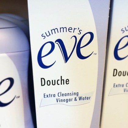
While I am a huge advocate of cleanliness and healthiness and I absolutely appreciate the cleaning properties of vinegar – I’m not sure if this is something I’d find appealing when looking for a product that I’m going to use on my most sensitive regions.
OK, two things.
1. I appreciate I WOULDN’T be using it on my sensitive regions.
[Sorry for that image]
2. Like Listerine [until they came out with the orange flavour, which is still madness personified] I get that some products need to leave you with an ‘ugly tingling feeling’ so you emotionally feel you have been cleaned. So to speak.
But seriously, is vinegar the sort of thing you’d want to use on yourself?
Maybe it’s because I’m a bloke – and an English bloke – but the word vinegar conjures up images of chips and while I would love to eat a bag of them covered in Sarsons [not that overpriced, poncy stuff] I’m pretty sure I wouldn’t want my nether-regions to smell of them.
I wonder if that means this product isn’t available in the UK given vinegar’s strong association with dodgy food.
Actually I wonder if any normal person would spend this much time thinking about this subject?
Alright … maybe I’m a sad, weird freak but this product stopped me in my tracks, but that could also be because the naming is some of the weirdest I’ve ever seen in my life.
It starts off all nice and angelic with ‘Summers Eve’.
Oh that’s a nice name … it paints pictures of a beautiful evening sky, full of beautiful colours promising a bright tomorrow.
Then they throw in ‘Douche’.
OK, that kind of ruins the picture a bit because at best you think of someone you know who is a total idiot and at worst, you think of something a woman uses to clean her privates.
Then they double down with ‘Extra Cleaning Vinegar & Water’.
And with that, the beautiful evening sky has been replaced with the feeling of needles being jabbed where you never ever want them jabbed.
Seriously, that naming combination has to be the weirdest ever.
Surely they could have thought of other ways to talk about douche’s and vinegar given they’d come up with such an evocative product name.
But no. They didn’t which is why instead of Summers Eve, they should have called it Winter’s Worst and be done with it.
Filed under: A Bit Of Inspiration, Attitude & Aptitude, Culture, Cunning, Design, Social Commentary
As I’ve written many time before, society is going through an ‘immediate gratification’ phase.
Whether it’s turning to the internet or food delivery services or credit cards … we all want what we want NOW.
Doesn’t matter about the implications or the accuracy, we don’t want to wait for anything. Ever.
I say all this because yesterday, I received this in my mailbox …

Yep, it’s a TV dinner frying pan from a company called Amazing Pan.
To be honest, the name Amazing Pan is a bit of a stretch given all they’ve done is compartmentalise a normal frying pan so you can shove a bunch of different foods in it … but given I’ve never seen one of these before, maybe I’m being a bit harsh on their ingenuity.
OK, on the plus side it’s a product that is still encouraging people to actually do something rather than hand it to them on a plate [though, in a weird way, they’re also doing that as well] but who the hell needs a product like this:?
Seriously, how hard is it to use a few extra pots and pans?
What next … a tooth brush that doubles as a toilet brush?
Actually that already exists, or at least it did when I decided to teach my awful housemate when I lived in Wollongong, Australia.
Yes, I know I’m going to hell, but I work in adland so that was always guaranteed anyway.
Filed under: Attitude & Aptitude, Communication Strategy, Creativity, Culture, Design, Marketing, Standards
So I was reading a magazine this week when I saw this …

As you can see, it’s a photo of the NBA offices in the US, but what I love is the way the area around the lift buttons has been designed to look like a basketball.
Not a big thing you may say … and you’re probably right, but that sort-of attention to detail shows someone who has thought about what they’re doing and cares about what they’re making and in this day and age, I find that more impressive and appealing than the hype that goes along with every big ad campaign launch.
For me, this is more evidence that some of the most interesting work these days is coming from design firms rather than ad agencies.
Maybe that’s because design has to think in the long term whereas most ad campaigns think about the next 30 seconds … but in terms of developing ideas with lasting and sustainable impact, I think design companies are miles ahead from most ad agencies these days and if anything should kick our arse to get back to our craft, it’s that.